A MUST READ.
Why it is important to have a banner and navigation that is appealing to your audience.
I've been extremely busy these past few weeks editing just the header of my blog. Recently I've been reading up on a "call to action" method and one thing I figured out is I really get bored of blogs that seem less inviting and naturally the first thing you see is the header (the top of the blog) before the content. My eyes take a millisecond to glance at their web design before viewing the content I came for. Usually, I read whatever information it is I needed, then I exit out without having to search any further into the owners blog simply because the design didn't interest me.
I had to do something to change the way my header looked. Something more compelling and not just navigation thrown up there in hopes that my visitors would click on them after reading a content. So I looked deeper into the matter and fathomed many blogs I follow I then asked myself what is it that makes me a repeat visitor, besides of course the admiration for the beautifully put post they've conjured. It was their header that made an impact on me during my first visit.
Hmm? I thought, that seems interesting I'll click it once I've read the information I came for and before you know it I have spent at least 5 to 10 minutes lost in their blog.
Hmm? I thought, that seems interesting I'll click it once I've read the information I came for and before you know it I have spent at least 5 to 10 minutes lost in their blog.
Here is where the call to action comes in. I don't have a lot of traffic and I am working my very hardest to make that my next important goal but when I do have visitors my bounce rate is very high. So how did I change that this past week?
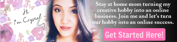
I simply made a call to action banner. Big, bold and right in your face banner. I came up with a short appealing sentence to entice the reader to want to read more of my content. If you are a Pat Flynn student like I am you know that this banner is where I got the idea from. I just made it conform to my niche and sorta made it more feminine like because the majority of my visitors are females.
Now instead of the 50 second visits it has now changed to 1 to 2 minutes. I have Clicky and my heatmap tells me that most of the clicks are on the Get Started Here button. I now know this change would put me on the right track to a low bounce rate. I don't have tons of valuable content yet so my blog is prone to a high bounce rate but for now I am taking baby steps towards a better blog.
I still have tons of work to do on my navigation before I work on the rest of my blog and since I can't really afford a professional to design my blog I must learn to do it on my own. Just another skill added to my bucket list.
Do you think it is important to have an appealing header and navigation menu? or Would you much rather have a simple header and navigation menu?
No comments:
Post a Comment